
A product manager we'll call Priya spends three weeks perfecting a loyalty card pass. The brand colors pop. The logo sits crisp in the corner. On her iPhone during QA, it's flawless. She ships it feeling great.
Then a colleague opens the same pass on his Samsung Galaxy. The logo is cropped. The strip image? Gone. And that first "welcome" push notification she scheduled never shows up on his lock screen at all.
Priya assumes it's a bug. It isn't. It's by design.
Apple Wallet and Google Wallet share the same basic idea: a digital card living in your phone's wallet. But they're built on different design philosophies, different rendering engines, and completely separate notification systems. A pass that converts beautifully on one can underperform badly on the other. Most issuers don't catch it until they're staring at split engagement metrics, wondering why Android numbers look so weak.
Here's exactly why this happens, and what to do about it. No code required.
The illusion of "one pass fits all"
A wallet pass is not a universal container you fill once and ship everywhere.
Apple Wallet passes use the .pkpass format, a signed bundle with strict rules. Google Wallet passes are JWT and JSON-based objects defined through pass classes. These aren't two flavors of the same thing. They're two different products with different opinions about how your brand should look.
Apple is opinionated and rigid. Every pass belongs to a fixed type: boarding pass, coupon, event ticket, store card, or generic. That category dictates the layout. You work inside the box Apple gives you.
Google is flexible and modular. Its pass classes let fields rearrange more freely, which sounds great until you realize that flexibility also means unpredictability. The same data can surface in wildly different visual hierarchies depending on the device.
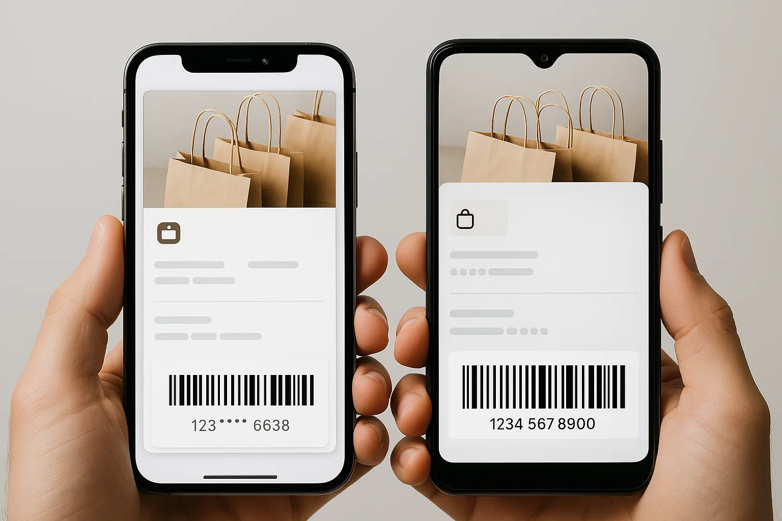
The business consequence is sneaky. Issuers build one design, distribute it across both platforms, and end up with a pass that's "good enough" on neither. Not optimized for Apple. Not optimized for Google. Just fine. And fine doesn't drive foot traffic.
To make this concrete, we'll compare the two platforms across five dimensions that actually affect performance: visual rendering, lock screen behavior, notification delivery, update latency, and the installation experience.
Visual design constraints: what each platform will (and won't) let you do
| Design surface | Apple Wallet | Google Wallet |
|---|---|---|
| Layout model | Fixed template zones: logo, strip image, thumbnail, field grid | Adaptive, reflows across OEM skins and screen sizes |
| Strip image spec | 375×144pt standard, 375×123pt on newer layouts. Deviate and Apple crops or rejects | Hero image with more placement freedom |
| Typography | Fonts, type sizes, and field order are non-negotiable | More latitude, less predictability |
| Brand colour fidelity | Hex value renders as designed | May shift depending on how an Android skin handles dark mode |
| What it asks of you | Precision | Testing across a device matrix |
Start with Apple. Its passes are built from fixed template zones. You get a logo image in the top-left, a strip image banner, a thumbnail, a background color, and a grid of label and value fields. The sizes are strict. A strip image runs 375x144pt on the standard spec (375x123pt on newer layouts), and if you deviate even slightly, Apple crops it or rejects the pass outright. Fonts, type sizes, field order? Non-negotiable.
That sounds limiting. It's also a gift. What you design is very close to what users see.
Google plays differently. Its rendering adapts across Android OEM skins, so a pass looks one way on Samsung's One UI, another on stock Android, and another on a Pixel. Screen sizes vary. Google Wallet app versions vary. The hero image, logo, and text fields have more placement freedom, but that freedom is also where inconsistency creeps in.
Consider a coffee shop loyalty pass with a deep, dark brand color. On Apple Wallet, that hex value floods the pass cleanly and looks exactly as designed. On Google Wallet, the same color might shift depending on how a particular Android skin handles dark mode. Two users, same pass, two different results.
A useful way to think about it: Apple is design within constraints. Google is design within possibilities. Apple rewards precision. Google rewards testing across a device matrix. Neither is wrong. They just ask different things of your design team.
Lock screen behavior: the moment that drives (or kills) engagement
Lock screen surfacing is the feature worth prioritizing. It puts your pass in front of users at the right moment, automatically, at no media cost.
Apple nails this. Location and time triggers surface passes automatically on the iPhone lock screen. Walk near a coffee shop and its loyalty card pops up, ready to tap. This runs off the locations and relevantDate fields in the pass spec. NFC-enabled passes surface during tap interactions too. The whole system is mature, reliable, and it converts.
Google's version is shakier. Android leans on Semantic Location and Google Maps for context triggers, but the behavior swings across Android versions and OEM setups. A Pixel 8 handles it one way. A Galaxy S24 handles it another. The result is less predictable surfacing, which means fewer perfectly-timed impressions.
Issuer reports and platform studies consistently point the same direction: Apple Wallet lock screen triggers outperform equivalent Google Wallet setups on open and tap rates, mostly because the OS-level plumbing is more reliable.
So if lock screen impressions are a primary KPI, for retail foot traffic or event check-in, plan platform-specific relevance configurations. Don't assume Android will surface your pass just because iOS does.
Push notifications and pass updates: the hidden performance gap
This is where wallet campaigns quietly lose performance. Teams assume notifications and updates work the same on both platforms. They don't. Not even close.
Apple routes everything through Apple Push Notification service (APNs). Update a pass server-side, send a push payload, and the device fetches the new version. Delivery lands in seconds to a few minutes, reliably. Apple's permission model also means the people who opted in are genuinely high-intent.
Google runs its own push infrastructure, and it's more opaque. You can trigger pass updates through the Google Wallet API, but Google decides whether and how to surface that update as a notification. Battery optimization settings, Android version, and OEM notification management all get a vote. On Xiaomi, OnePlus, and some Samsung devices, aggressive battery management can quietly bury your update.
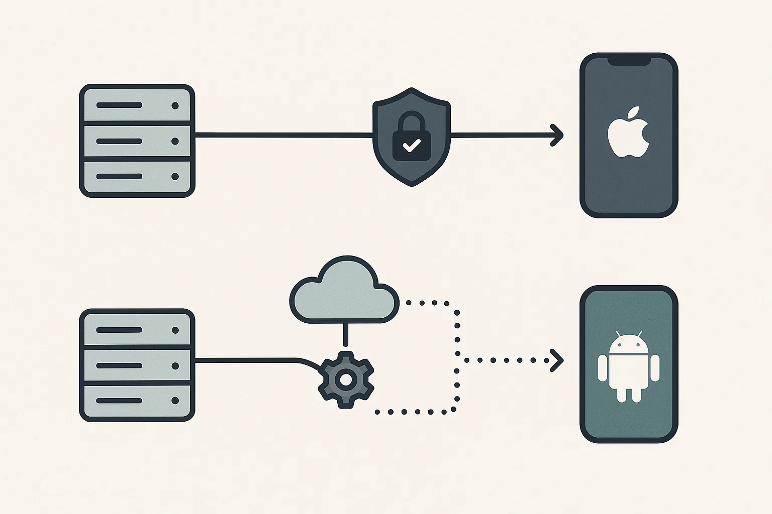
Here's a scenario Passmint customers have actually documented. A retail brand pushes a "flash sale, 20% off for the next 4 hours" update to 50,000 users. On iOS, more than 80% of passes update and surface within 10 minutes. On Android, it's uneven. Some users get it fast. Others get it hours later, well after the offer expired. Same campaign, radically different outcomes.
The fix is practical. For time-sensitive pushes, build platform-aware backstops. Supplement Google Wallet updates with an SMS or email nudge to Android users so a delayed notification doesn't torpedo your whole campaign.
The installation experience: first impressions across platforms
Every pass has a conversion funnel, and installation is the step most teams underrate. Friction here directly cuts how many people actually end up carrying your pass.
Apple makes it feel first-class. Tap a .pkpass link and iOS fires up a native preview sheet. The pass renders full-screen, instantly, with a clear "Add" button. No app to download. No account to create. That single-tap flow has very low abandonment.
Google's "Save to Google Wallet" flow asks more of the user. It needs the Google Wallet app installed, which isn't guaranteed on every Android device, especially in some international markets. Sometimes it requires a Google account sign-in. The preview feels more like a web redirect than a polished native moment.
Market fragmentation makes this worse. In regions like Southeast Asia and parts of Eastern Europe, non-Google Android (AOSP) devices are common, and the Google Wallet install flow can break entirely. For a global issuer, that's a real gap.
The pattern is clear: Apple Wallet wins top-of-funnel acquisition because of lower install friction. Google Wallet earns its keep later, through ecosystem integrations like Maps, Search, and Gmail smart chips that keep your pass ambiently useful over time.
A loyalty program pass across both platforms
To ground all this in one scenario: a mid-size retail brand launches a digital loyalty card on both platforms at once.
On Apple Wallet, the team optimizes the strip image at 375x144pt to feature hero product photography. They pick the "store card" pass type to show points balance in the header. They set location triggers for all 12 store locations.
On Google Wallet, they go wide, using a larger hero image that pops on bigger Android screens, and configure loyalty class fields so tier status shows up front and center.
For notifications, Apple gets direct APNs pushes for time-sensitive offers, sent with confidence. Android gets the same offers via the Google Wallet API, plus a "heads up" email acknowledging that delivery timing can vary. A small hedge that protects the campaign.
Then they measure with platform-split metrics: install rate, lock screen impression rate, notification open rate, and in-store scan rate, all broken out by platform. The findings are telling. iOS users engage 2.3x more with lock screen triggers. But Android users who do install show stronger long-term retention, correlated with their loyalty card surfacing inside Google Maps navigation.
Neither platform wins across the board. Apple wins on acquisition friction and notification reliability. Google wins on ecosystem discovery and long-term surfacing. Smart brands lean into each strength instead of fighting each constraint.
The decision framework
How do you decide when to unify and when to split? Three variables matter: campaign type, audience composition, and design resources.
| Scenario | When it applies | What to build |
|---|---|---|
| Unify | Even platform split, evergreen campaign, tight design bandwidth | One shared design built to Apple's spec, the more restrictive of the two |
| Differentiate visually | Strong brand equity and a design team to support it | Platform-native versions: Apple's strip zone for tight photography, Google's hero for wider creative |
| Differentiate operationally | Use case lives on notifications: flash sales, real-time loyalty, event-day alerts | A platform-aware notification strategy from day one |
Scenario A, unify. Your audience splits evenly across platforms. Your campaign is evergreen, like a membership card with no time-sensitive updates. Design bandwidth is tight. Build one shared design that respects Apple's spec, the more restrictive of the two. It's a defensible starting point.
Scenario B, differentiate visually. Your brand has strong visual equity and the design team to support it. Build platform-native versions. Use Apple's strip zone for tight branded photography. Use Google's hero image for wider creative. The data stays identical. Only the presentation layer changes.
Scenario C, differentiate operationally. Your use case lives on notifications: flash sales, real-time loyalty updates, event-day alerts. Build a platform-aware notification strategy from day one. Never assume Android behaves like iOS.
The strongest pass programs in 2025 treat these two platforms the way sharp email marketers treat desktop and mobile rendering. Same content strategy. Deliberately different execution. Passmint is built to make that dual-track approach manageable without doubling your workload.
The takeaway
Remember Priya, whose pass looked perfect on iPhone and broken on Android? She didn't need to rebuild anything from scratch. She needed a platform-aware strategy.
Apple Wallet and Google Wallet are not interchangeable delivery channels. They hold different visual contracts with your brand. They have different reliability profiles for notifications and updates. They behave differently on the lock screen and carry different installation friction. Treat them as identical and your pass program will quietly underperform on at least one platform, often the one where your best customers happen to live.
And the gap is widening, not closing. Apple is expanding Wallet with Apple Intelligence. Google is deepening Wallet's role across Maps and Search. The platform differences will grow through 2025 and beyond. Issuers who build platform-fluency into their strategy now will consistently outperform those who don't.
Want to see how this works in practice? Explore how Passmint helps teams design, deploy, and manage passes across both Apple Wallet and Google Wallet, with the tooling to go platform-native without the extra overhead.
Primary sources
Common questions
Technical content writer, Passmint
Julio is a technical content writer at Passmint. He writes about Apple PassKit, the Google Wallet API, and what breaks when wallet passes meet production traffic.
More from Julio Song →