
A product manager goes into a quarterly review with numbers that look strong. Fifty thousand passes issued. A 68% install rate. Thousands of push notification opens. The slides show growth. The trendlines point up. The budget gets approved for another year.
Six months later, the program is shut down. It never moved the revenue needle.
Every one of those numbers was a vanity metric. They measured activity, not outcomes. Because the mobile wallet industry still lacks a standard measurement framework, most teams optimize for numbers that feel good instead of numbers that predict business results.
The difference between a wallet pass program that gets cut and one that gets scaled is rarely the technology. It is whether your team can connect pass behavior to revenue signals that leadership cares about.
Four KPIs separate the programs that survive from the ones that get quietly killed: retention rate, pass deletion velocity, notification-to-redemption conversion, and re-engagement lift. Below is how to measure them, what good looks like, and how to present them in a language your CFO understands.
Why the default metrics are lying to you
The core problem is vanity metrics. Total passes issued, raw installs, and open rates are activity metrics. They tell you what happened, but not what it meant for your business.
These metrics became industry defaults for simple reasons. They are easy to pull. They trend upward naturally over time because you are always issuing more passes. They mirror familiar email and app marketing dashboards that stakeholders already know how to read. When your reporting looks like something a VP of Marketing has seen before, nobody asks hard questions.
Now consider this scenario. A loyalty program reports 40,000 active passes and a 45% notification open rate. It sounds healthy. Look deeper. Sixty percent of those passes were added to a wallet and never used again. The "active" count includes thousands of dormant installs. The program is not growing. It is in quiet decline.
This creates what we can call metric debt. You build your reporting around the wrong numbers. Your dashboards, executive summaries, and team OKRs all anchor on vanity metrics. Changing course becomes painful, because it means more than editing a spreadsheet. It means admitting the story you have been telling was incomplete.
The fix is a smaller set of metrics that link directly to retention and revenue.

The four KPIs that actually predict program health
KPI #1: Retention rate (30/60/90-day)
Retention rate measures the percentage of pass holders who still have the pass installed and have logged at least one qualifying interaction within a given window.
A qualifying interaction is a notification tap, a barcode scan, or a balance check. Simply having the pass sitting in a wallet does not count.
This is the most important leading indicator of program longevity. If your 60-day retention rate is declining quarter over quarter, new installs will not save the program. You are filling a bucket that leaks too fast.
KPI #2: Pass deletion velocity
Deletion velocity is the rate of deletion relative to new installs over a rolling 30-day period, not a raw count of removals.
The formula is simple:
deletions in period ÷ new installs in period = velocity ratio
A deletion velocity above 1.0 means your program is shrinking in real terms, even if your slides highlight gross installs. Spikes in deletion velocity often line up with specific events: a poor redemption experience, a notification cadence that felt spammy, or a pass update that changed the look in a confusing way. It is an early warning signal.
KPI #3: Notification-to-redemption conversion
This is the ratio of push notifications sent to actual in-store or in-app redemptions. Not opens. Not taps. Redemptions.
Across many well-run wallet pass programs, a common target is in the high single digits to mid-teens. When this metric sits in the low single digits for a sustained period, it usually signals a gap between message relevance and pass utility. You send messages people see but do not act on. That path leads to deletion.
KPI #4: Re-engagement lift
Re-engagement lift is the measurable increase in purchase or visit frequency among customers who hold a wallet pass compared to a matched control group who does not.
This metric closes the loop between pass behavior and revenue. It is also the metric most likely to resonate with a CFO because it connects directly to dollars.
These four metrics form a system. Retention supports re-engagement lift. Deletion velocity is the early warning signal for retention decline. Notification-to-redemption conversion powers both. When one weakens, the others follow.

How to audit your current program in 30 minutes
Pull the last 90 days of pass data and answer five diagnostic questions:
- What is my 60-day retention rate?
- Is my deletion velocity above or below 1.0?
- What is my notification-to-redemption rate?
- Do I have a control group for re-engagement comparison?
- Can I link any of these numbers to a revenue outcome?
If your platform does not show deletion velocity directly, you can calculate it. Divide total deletions over a period by total new installs in the same period. A ratio above 0.8 needs investigation. A ratio above 1.0 needs action.
Two common failure modes appear in these audits. The first is teams that cannot answer any of the five questions because their analytics are not instrumented correctly. The second is teams that can answer them but have never presented them to leadership, because they do not know how to frame them as business metrics.
If full re-instrumentation is not feasible right now, start with a quick win. Track notification-to-redemption conversion manually within a single campaign cycle. Use UTM parameters or unique redemption codes tied to specific push sends. One campaign, one measurement. That alone puts you ahead of most programs.
Once you know where you stand, you need to know what good looks like.
Benchmarks and real-world program patterns
Consider a mid-size retail loyalty program that initially reported strong surface-level numbers. Seventy-five thousand passes issued. A 52% open rate.
The audit told a different story. The 60-day retention rate was only 22%. Deletion velocity was 1.3. The program was losing users faster than it added them.
The diagnosis was straightforward. The team sent an average of 4.2 push notifications per week. Nearly all were promotional. No balance updates. No tier progress alerts. No location-triggered relevance. Customers saw many messages that did not feel useful, and they deleted the pass.
The intervention was clear. Reduce notification cadence to one or two sends per week. Add utility-based triggers such as points balance milestones and expiry reminders. Redesign the pass back panel to surface actionable information.
Within 60 days, deletion velocity dropped to 0.6. The 60-day retention rate climbed from 22% to 41%. Notification-to-redemption conversion moved from 2.1% to 9.4%.
The benchmark ranges below are based on common patterns across many programs. Treat them as orientation, not as published research. They describe programs we have seen rather than a controlled study.
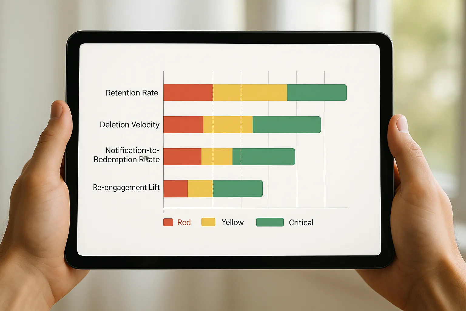
| KPI | Healthy | At risk | Critical |
|---|---|---|---|
| 60-day retention | 35-55% | 25-35% | Below 25% |
| Deletion velocity | 0.4-0.7 | 0.8-1.0 | Above 1.0 |
| Notification-to-redemption | High single digits to mid-teens | 3-6% | Below 3% |
| Re-engagement lift vs control | 15-30% purchase frequency increase | 5-15% | Below 5% |
Read the retail example above against this table and the diagnosis is immediate: 22% retention and a deletion velocity of 1.3 are both in the critical column, which is why a 52% open rate was never the number that mattered.
One platform nuance matters. Apple Wallet and Google Wallet pass behavior can differ in measurable ways. In aggregate data we have seen, Android users delete passes more readily but also re-add them more often. That means raw deletion count can be a less reliable signal on Google Wallet unless you pair it with re-add rate.
Segment-level benchmarking also matters. A loyalty tier program should track these KPIs by tier. High-value customers, your top 20%, will usually show higher retention and conversion rates. If you blend them with the full base, you can hide problems in the middle and lower tiers, exactly where you need visibility.
Connecting pass performance to revenue outcomes leadership cares about
Most pass program managers speak in engagement metrics: opens, taps, installs. Most executives speak in business metrics: repeat purchase rate, customer lifetime value, incremental revenue. Bridging that gap takes more than better wording in the deck. It takes intentional data design from the start.
Here is how to calculate re-engagement lift as an incremental revenue metric:
Average order value × incremental purchase frequency per customer × active pass holder count = estimated incremental annual revenue from the pass program
Take a modest scenario. You have 10,000 active pass holders with a 65 dollar average order value. The pass program drives a 1.2× purchase frequency lift, meaning pass holders buy 20% more often than non-holders. If a non-holder makes 4 purchases per year, a pass holder makes 4.8.
That is 0.8 extra purchases × 65 dollars × 10,000 customers. The result is 520,000 dollars in estimated incremental annual revenue. Even if you attribute only part of that lift to the pass, the ROI case is clear.
If you do not have a control group, you can build a simple proxy. Use a time-lagged cohort. Take customers who signed up for your loyalty program in the 90 days before pass launch. Compare their 6-month purchase frequency to the pass-holder cohort. It is not perfect, but it is far better than no comparison.
Be honest about attribution. Wallet pass programs run alongside email, SMS, and app push. Pass-driven lift is rarely isolated. When you present to leadership, use contribution language instead of strict causation. Say "our pass program contributes to an estimated X lift" instead of "our pass program caused X." Executives are skeptical of clean causation claims. They respect nuanced contribution analysis.
Your concrete deliverable: a one-page "Pass Program Health Card" that shows the four core KPIs along with a single revenue connection metric, such as re-engagement lift or incremental repeat purchase rate. Design it for a five-minute leadership update. Keep it to one page.
Building a measurement stack that scales
Measurement maturity comes in three levels.
At the basic level you have platform-native analytics tracking installs, deletions, and notification sends, with no extra tooling beyond your pass issuance platform. If you are using Passmint, built-in analytics cover this out of the box.
The intermediate level adds custom event tracking tied to redemption events, segmented retention cohorts, and deletion velocity calculations. This requires webhook or API integration between your pass platform and an analytics tool like Mixpanel, Amplitude, or a data warehouse.
The advanced level is full CRM integration linking pass behavior to customer purchase history. This enables true re-engagement lift measurement and CLV attribution, and it requires a customer identity join between the pass platform and your CRM or POS system.
Most teams can reach the intermediate level within roughly one sprint if they already have an analytics platform in place. The advanced level is often a four to eight week project for a team with basic data engineering capacity.
The biggest measurement mistake teams make is treating analytics as an add-on instead of a design requirement. Pass IDs should tie to customer IDs from day one. Every pass update or notification send should carry a campaign tag. If you instrument only after launch, you will have gaps in your data that you cannot fully repair.
Passmint supports both the intermediate and advanced levels. Native webhook support and campaign analytics let you move from vanity metrics to signal metrics without heavy engineering work. The platform handles pass creation, distribution, and updates through a clean API, and you can feed behavioral data into the analytics stack you already run.
The quarterly review, rewritten
Return to that quarterly review. Same product manager. Same room. Different story.
This time, they bring a one-page Pass Program Health Card. It shows a 41% 60-day retention rate, up from 22%. A deletion velocity of 0.6, down from 1.3. A 9.4% notification-to-redemption rate. A calculated re-engagement lift that translates to an estimated 180,000 dollars in incremental annual revenue from a 10,000-person active pass cohort.
The program expands instead of getting cut. What changed was not the technology. It was what the team chose to measure.
Start now. Run the 30-minute audit described above. Answer the five diagnostic questions. Calculate your deletion velocity. Build your first Pass Program Health Card. If you want infrastructure that makes signal metrics easy to capture from day one, see how Passmint's API, webhook support, and campaign analytics can give your program the measurement foundation it needs to prove ROI and grow.
Primary sources
Common questions
Technical content writer, Passmint
Julio is a technical content writer at Passmint. He writes about Apple PassKit, the Google Wallet API, and what breaks when wallet passes meet production traffic.
More from Julio Song →